NYC Taxi - Statistics
One of the most iconic sights in New York are its Yellow cabs. They are ubiquitous and an important lifeline that tie the city and its inhabitants together. Understanding how cabs move around can give us new insights into how people travel within the city, how people use the city, and which neighborhoods are popular.
Recently this data was only something data scientist could dream of, that is until Chris Wong through a FOIL request (Freedom Of Information Law) got access to it! You can read more about the legal process he had to go through here.
The data is actually quite amazing, around 20 GB in size it contains detailed logs of roughly 173 million taxi trips during 2013. This cover fields such as: Taxi_id, pickup and dropoff locations, trip duration, fare price, tip amount, etc. There have unfortunately been some problems regarding the anonymization and privacy of the data. Nonetheless this data is a veritable gold mine for visualization specialists, data scientists and network scientists. So I decided to look into it.
First and foremost I had to download the data, however, downloading a 20 GB file can be a hassle. But don’t worry Andrés Monroy has decided to divide the data into smaller chunks and is currently hosting the files on a simple download page.
When you are dealing with 173 million data points there are always bound to be some outliers or corrupt entries. So a good idea is to plot some basic statistics first, such as distributions of duration, distance, and the geographical coordinates of trips. Plotting them I made some peculiar observations, such as trips lasting more than 48 hours or taxis suddenly ending up in the middle of the ocean. Disregarding these outliers we can begin to look at more interesting stuff.
First I collapse all data into one week and investigate if there are any differences between months in terms of raw number of trips (of course bearing in mind that each month can have different number of weeks and days so normalization has to be performed properly).
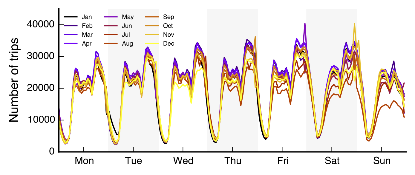
The plot shows the average number of trips per hour during a week. In weekdays activity is low during nights, but picks up after 8 am when the city start to wake up. At 5-6 pm there is a slight drop followed by an increase later in evening where people are going out to social events. Consequently this is later followed by a decrease during nighttime where people return to their homes. Interestingly we can observe that people stay out later as the week progresses. Sunday is a day of rest.
As we have the number of passengers per ride we can also investigate the flow of people within the taxi network. More specifically we can look into when people are more likely to share cabs.
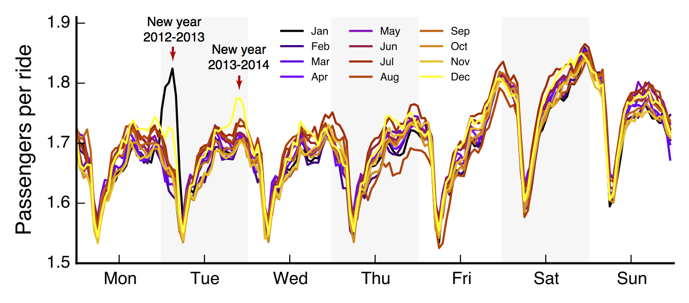
Again we divide data into months and collapse trips within each month into a weekly schedule. This should smooth away any fluctuations. We observe that more people share cabs during the weekends than during regular weekdays. Interestingly we also observe a special behavior during Tuesday morning for January and Tuesday night in December. As it turns out these days mark New Year celebrations. The jump on Monday night / Tuesday morning marks the flow of people going home after the 2012-2013 celebration, while the peak during Tuesday night marks movement of people traveling to their respective parties for the 2013-2014 celebration.
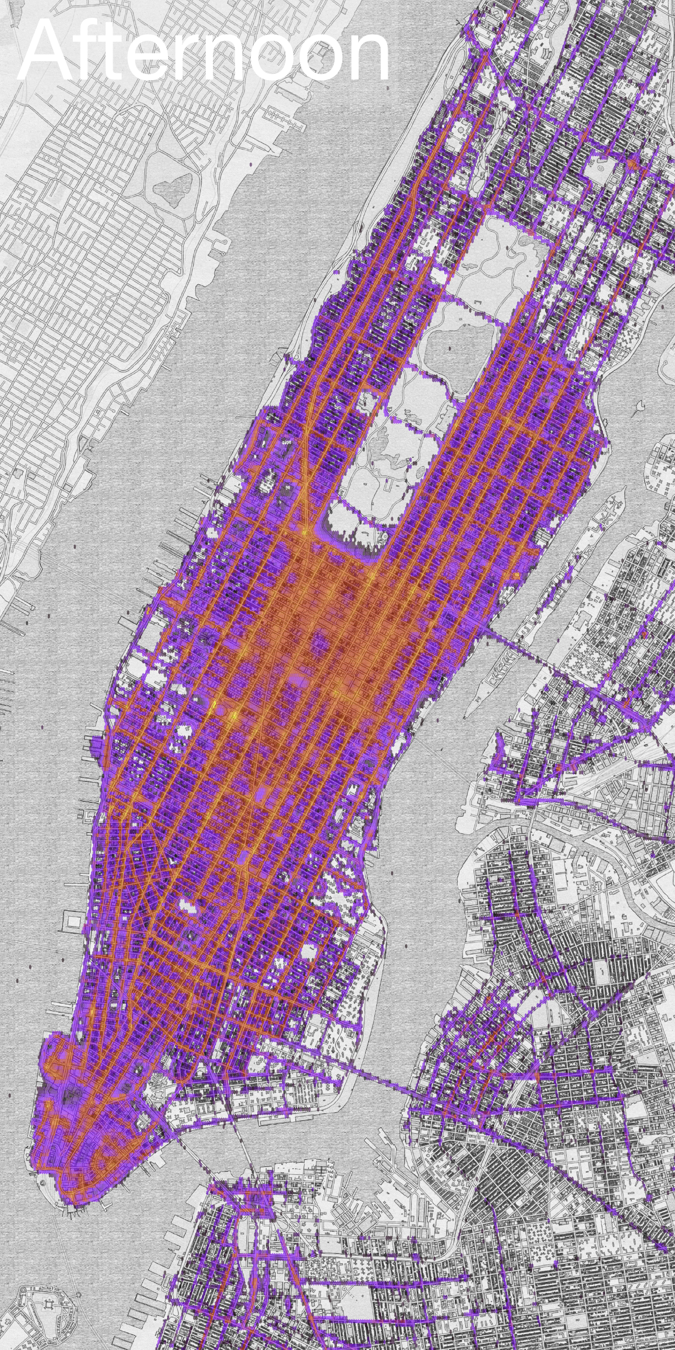
With this much data we can also look into locations from where it is easiest to catch a cab. Plotting 173 million data-points, however, is not informative, a better idea is to bin them. The figures below show 2D hexagonal histograms for the pickup locations of taxi trips divided into afternoons (2pm-9pm) and nights-rides (9pm-3am) respectively. Independent of the time of day there always seems to an abundance of cabs in Midtown. During nighttime some differences arise, and more people are picked up in the West Village, Little Italy and Nolita — clearly indicating party districts.
|

|
This is a work in progress, and there is more to come!