Global Airport Network
 I like to keep track of my life; collecting data about random things–one of them happens to be my travel patterns.
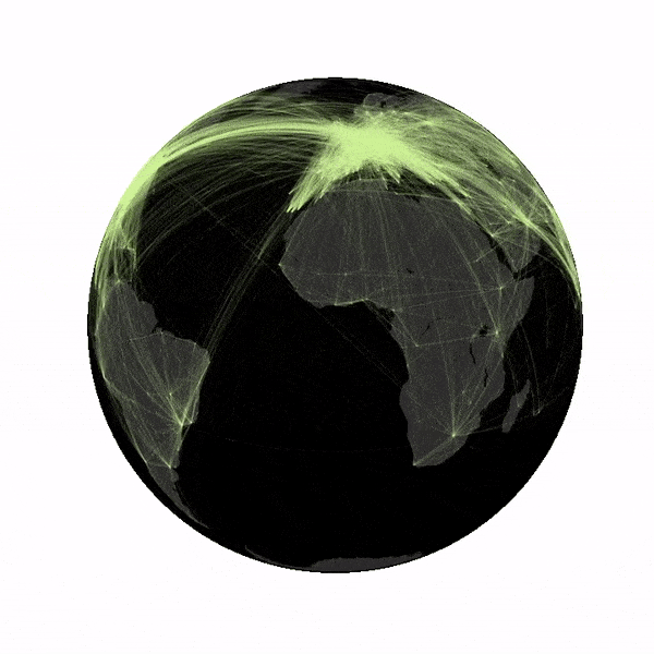
While visualizing my own travels I started to wonder what the global airport network might look like.
I remember reading about the structure of the airport network in the architecture of complex weighted networks by A. Barrat et al. but the paper never visualized the network.
To figure it out, I first needed some data, luckily OpenFlights.org has a database of routes as well as airports, which allows us to create some pretty nice looking visualizations (see above figure).
I like to keep track of my life; collecting data about random things–one of them happens to be my travel patterns.
While visualizing my own travels I started to wonder what the global airport network might look like.
I remember reading about the structure of the airport network in the architecture of complex weighted networks by A. Barrat et al. but the paper never visualized the network.
To figure it out, I first needed some data, luckily OpenFlights.org has a database of routes as well as airports, which allows us to create some pretty nice looking visualizations (see above figure).
Code
First lets import some packages, there are tons of good plotting libraries, I personally love matplotlib because it allows you to customize everything.
import matplotlib.pyplot as plt
from mpl_toolkits.basemap import Basemap
import pandas as pd
import numpy as np
from collections import Counter
import random
Next let’s load the data. As multiple airline companies can fly the same route I have chosen to count the number of flights between airports and weight links between cities accordingly.
# load airport data
data = pd.read_csv('airports.csv')

# load route data
edges = Counter()
with open('routes.csv') as f:
    next(f)
    for line in f:
        airline,airline_id,source,source_id,destination,destination_id,codeshare,stops,equipment = line.split(',')
        edges[min(source_id,destination_id),max(source_id,destination_id)] += 1

pos = dict(map(lambda x: (str(x[0]),(x[1],x[2])), data[['airport_id','longitude','latitude']].values))
Finally we define a plotter function, here I use basemaps to draw the globe (using an orthographic projection) and to plot routes (using great circles). Unfortunately we need to use a hack as the function drawgreatcircle will give wrong results if the end points of the great circle are not located in the same field of view.
def world(lat0,lon0,color):
    # construct map projection
    m = Basemap(projection='ortho',lat_0=lat0,lon_0=lon0,resolution='c')
    # draw coastlines, country boundaries, fill continents.
    #m.drawcoastlines(linewidth=0.1,color='white')
    m.fillcontinents(color='#515151',lake_color='#282828')
    # draw the edge of the map projection region (the projection limb)
    m.drawmapboundary(fill_color='#282828')

    # transform points
    count = 0
    for (ei,ej),w in edges.items():
        if ei in pos and ej in pos:
            # draw routes
            # get coordinates for great circle
            x, y = map(np.array,m.gcpoints(pos[ei][0],pos[ei][1],pos[ej][0],pos[ej][1], 150))
            m.plot([x[j] for j in range(len(x)) if x[j] < 10e20 and y[j] <= 10e20], # small hack
                   [y[j] for j in range(len(y)) if x[j] < 10e20 and y[j] <= 10e20],color=color,lw=w*0.1,alpha=0.1)
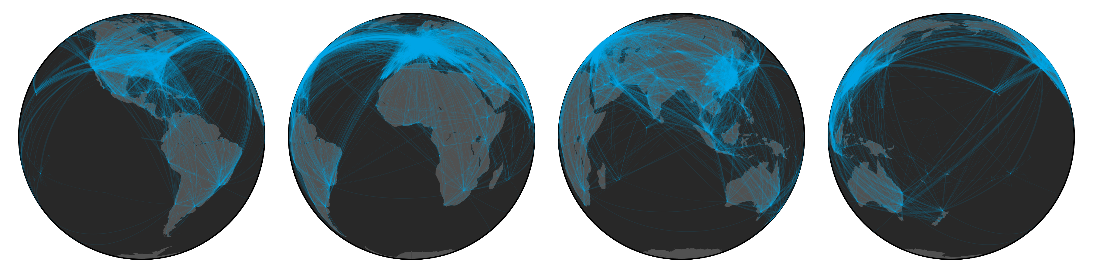
To create the above figure we use:
# draw points on globe
plt.figure(figsize=(12,3))

plt.subplot(1,4,1)
world(0,-90,'#00AEEF')

plt.subplot(1,4,2)
world(0,0,'#00AEEF')

plt.subplot(1,4,3)
world(0,90,'#00AEEF')

plt.subplot(1,4,4)
world(0,180,'#00AEEF')
plt.tight_layout()

plt.savefig('airports.png',transparent=True,dpi=300)
plt.close()
Varying the lat0 and long0 parameters allows us to rotate the globe. Combining this with imagemagick and choosing a bit more gloomy color scheme we can create the below gif.