Representation of Politics from Space
(Disclaimer: This post is also featured on the Data Culture blog)
Satellite images can tell us a lot about our world and societies.
Images taken from space have, among other things, been used to map pollution, predict crop yields, estimate poverty, and measure the achievement of the Sustainable Development Goals.
Here, however, we are going to explore a different aspect of remote sensing – a somewhat more qualitative and artistic aspect.
We’re going to look into what satellite imagery can tell us about politics.
The question we’re asking is: can we observe certain structures from satellite images, structures such as how we organize cities and landscapes? And could these things be indicative of the political inclinations of the populations living there?
Basically, what we want to do is to look at areas which predominantly support specific political parties and look at how these places look from space. Will the places that vote conservative be sprawling urban metropolises or rural areas? Similarly, will places that vote for green parties be big cities or countryside? Before we go only, please note this is a pure correlation study - we are not saying anything about causality. There will be nothing about whether certain urban/rural structures cause politics, or whether politics results in certain landscape-wise structures.
This brings us to Denmark (for those of you who don’t know where, or what, Denmark is please read this wikipedia article). Denmark is a small country (twice the size of Maryland) with a population of 5.8 million inhabitants and it had its most recent general election in 2019. Because Denmark is a such small country, the vast majority of its landmass exhibits some form of human settlement, while only a tiny minority of its landmass is pure wilderness. As such, it is the perfect country to test out satellite imagery as a way to study political landscapes. (Also, I live in Denmark.)
The Danish parliament consists of 179 members from 14 political parties (5 members are independent). Here, however, we only focus on 6 parties, selected the get a broad representation of the political spectrum.
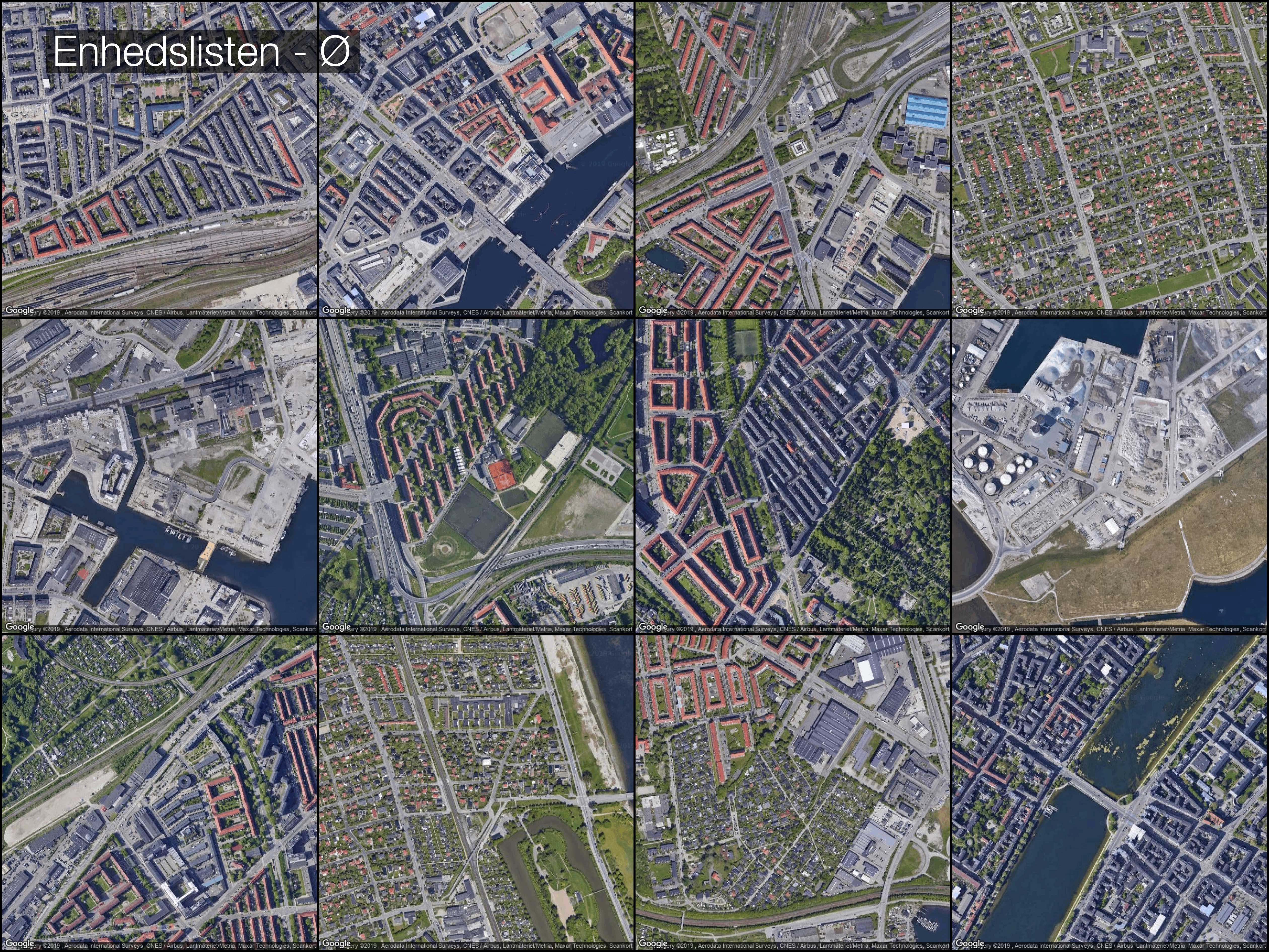
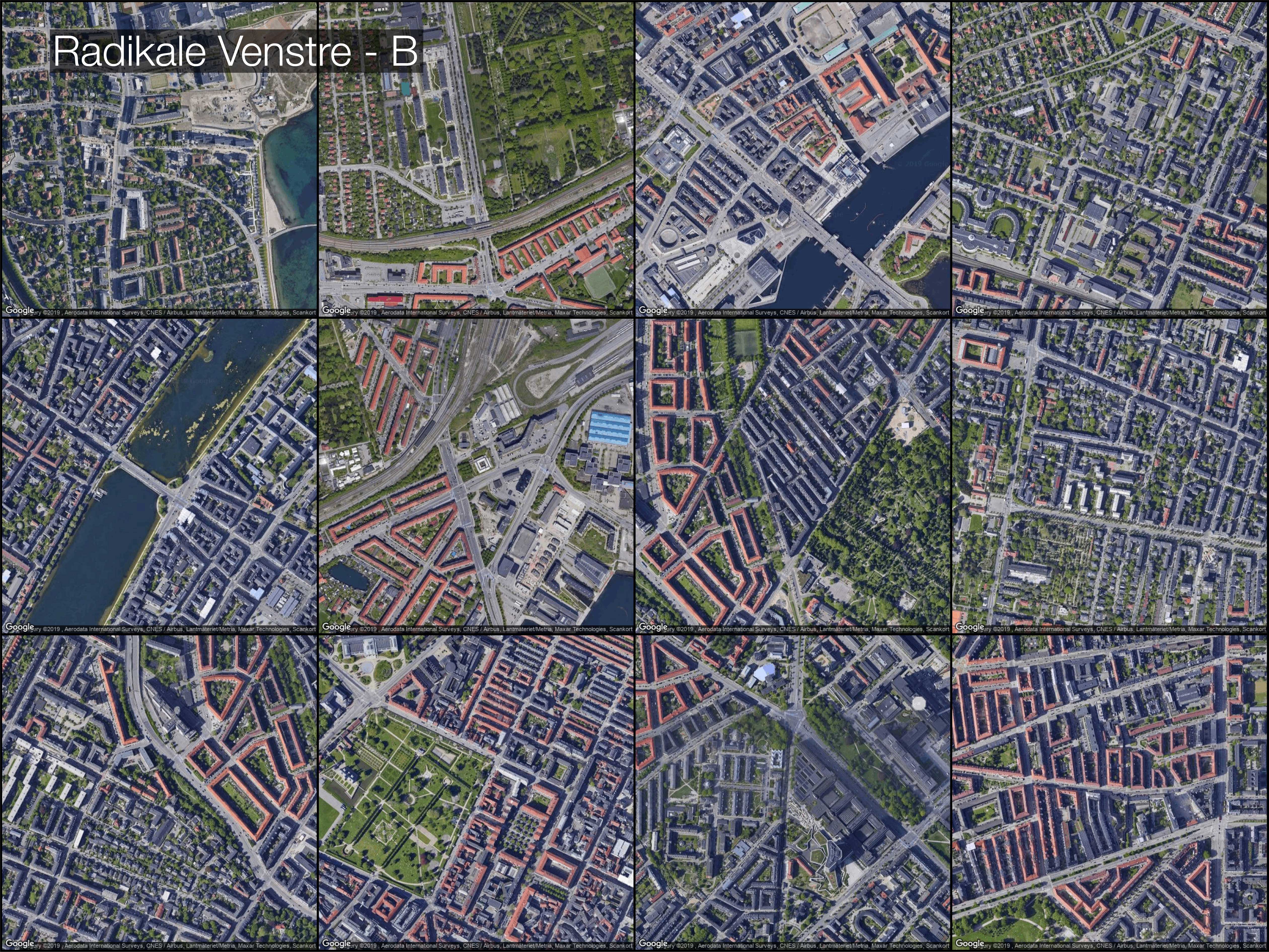
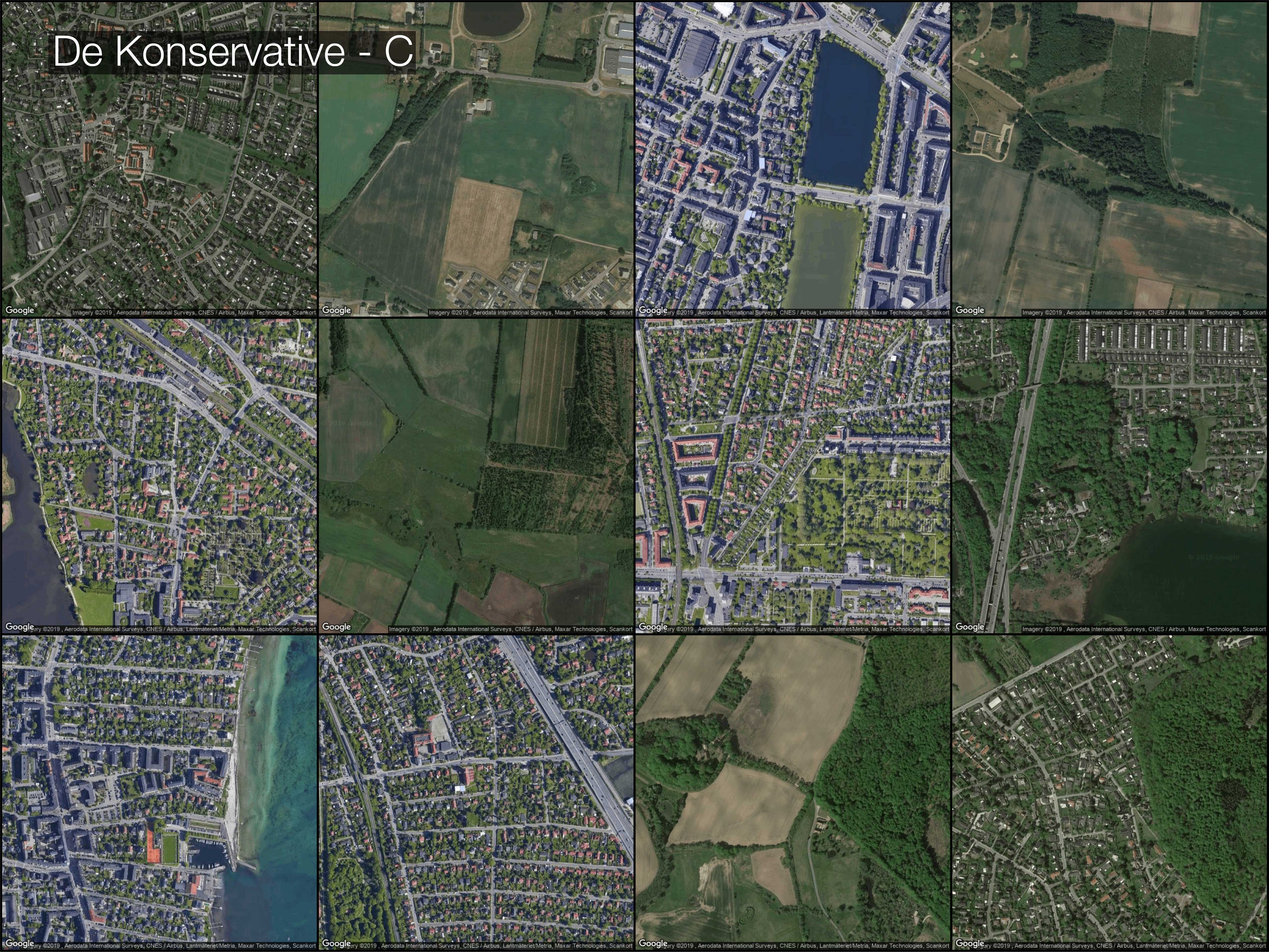
Skipping the most technical details (there’s more information below if you are interested in the nitty gritty details) we look at the 10 electoral districts (opstillingskredse) where each party has gotten the biggest percentage of the votes (for some parties it can be 30% of the votes for others 10%). From each electoral district we select 6 GPS points (see below for info) and download the corresponding satellite imagery tiles from Google. In total we end up with 60 tiles (satellite images) for each party. From these we randomly select 12 images and create the below mosaics.
Overall, we find:
-
The three biggest parties: the Social Democrats (Socialdemokratiet, current ruling party), the liberal party (Venstre, currently opposition), and Dansk Folkeparti (right-wing populists party) all have the biggest voter support from rural regions.
-
The green party (Enhedslisten) and the social liberal party (De Radikale) are popular predominantly in cities and highly urban areas.
-
The conservative party (De Konservative) draw support from a mix of urban and rural areas.
How did we do it? (Technical details)
There is an entire field devoted to the study of political affiliation and population demographics such as: age, gender, ethnicity, wealth, etc. Its called political demography. Think of it as a field that studies who would vote fom whom. For instance, in the 2016 presidential elections in the US (Clinton vs Trump) it was shown that demographics including men, folks of advanced age, and white individuals were more likely to vote for Trump, while Clinton got support from minorities, women, and younger individuals - read more here.
Here, we wanted to approach the same questions, who votes for whom, not using statistics but satellite imagery. We do this in 5 steps.
- Step one - Download the voting record from the 2019 election. We got ours from Danmarks Stastik (national statistical agency)
- Step two - Get shapefiles for the election districts. We got ours from the Danish Agency for Digitisation (Digitaliseringsstyrelsen)
- Step three - Sample GPS points from the shapefiles. We use python and shapely for this (see more on github). We do it in a very simple way. We pick 200 random points within each election district. To minimize the overlap of GPS points and to get as broad a coverage as possible of each district we cluster the sampled points using k-means into 6 clusters and use the median cluster positions to create final GPS points.
- Step four - Download satellite imagery. We use Google’s Static Maps API.
- Step five - Create image mosaics. We merge images programmatically using python.
Code is on github.
This code works well for Denmark, because the country is small and densely populated. Had we instead wanted to, for instance, do this for the US we would need to be more careful in how we sample satellite images. Because large swathes of the US are uninhabited, we would need to ensure we only look at images with human settlements. While it is possible to filter out uninhabated places using settlement maps from NASA or ESA, with Denmark this was not a issue.