Climate futures
Last weekend was Eurovision. You know Eurovision, right? Its a music contest with more viewers than super bowl! As an ardent supporter, and person who has seen the last 25 Eurovisions (at least), I was also tuned in this year.
TLDR; Sweden and Loreen won 🇸🇪🍾 beating crowd favourite Finland and Käärijä 🇫🇮💚 However, during the voting I noticed a strange discrepancy or dissonance between the jury and audience votes. Eurovision has strange voting rules, which have changed considerably over the years. The way points were awarded this year is through a somewhat complex process. 50% of points are awarded by national juries while 50% come from audience votes. The jury is there to ensure points are awarded to ‘good’ songs. According to the official rules, a jury must consist of five members from the music industry (singer, DJ, composer, lyricist or producer) and must have a fair balance of age, gender and profession. Their job is to evaluate the vocal capacity of the artist(s), the performance, the composition, and the originality of song. This year 37 countries participated, this means there were 37 juries (one for each country).
For each country 50% of their votes (or points) comes from the jury. The remaining 50% comes from the audience. The audience votes through SMS, by calling in, through the official app, or the voting website. Basically, the audience is you and me, regular people, anybody can vote (although it costs to vote). To summarize, the jury is composed of professionals, while the audience is ‘normal’ people.
What I noticed this year (and partially also last year) is that the tastes of the jury and audience are starting to diverge. For instance, this year Croatia 🇭🇷 got only 11 points from the jury, but 112 from the audience. They were ranked 25th by the jury, but 7th by the audience. Similarly, Spain 🇪🇸 got 95 points from the jury, but only 5 from the audience, who ranked it as the worst song
To understand this in more detail lets look at votes from the past 3 competitions (2021, 2022, 2023) Voting data comes from the Eurovision world website (fan community) and allows us to unpack voting preferences between the jury and audience.
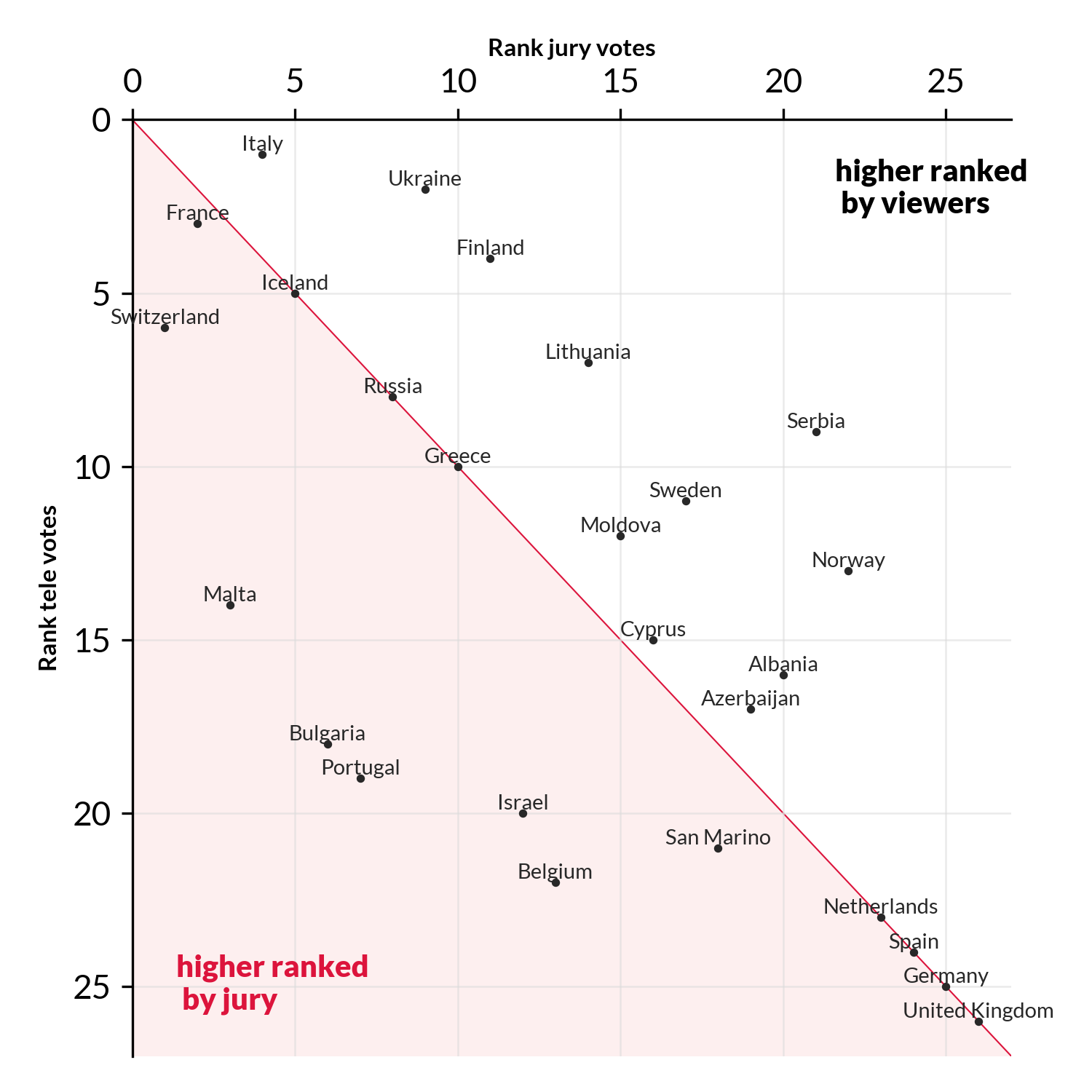
In 2021 there had a good agreement between the audience and jury votes. It has a rank correlation of R~0.64. An R=1 means perfect agreement, an R=0 means no agreement whatsoever, and R=-1 means opposite rankings, i.e. countries being ranked 1st by one party and last by the other. In the fig above, the red line denotes the diagonal. I.e. the area where jury and audience agree on the ranking. The farther away a country is from the diagonal the more the jury and audience disagree. Countries that appear in the red shared area ranked higher by the jury, while countries that appear in the white area are ranked higher by the audience.
Here, already some things stand out, the jury had Switzerland🇨🇭 as the best song, but the audience ranked it 6th. Similarly, the jury ranked Italy🇮🇹 4th (which won the competition 🏆) while they were ranked 1st by the audience. But overall there was an respectable overlap between the rankings.
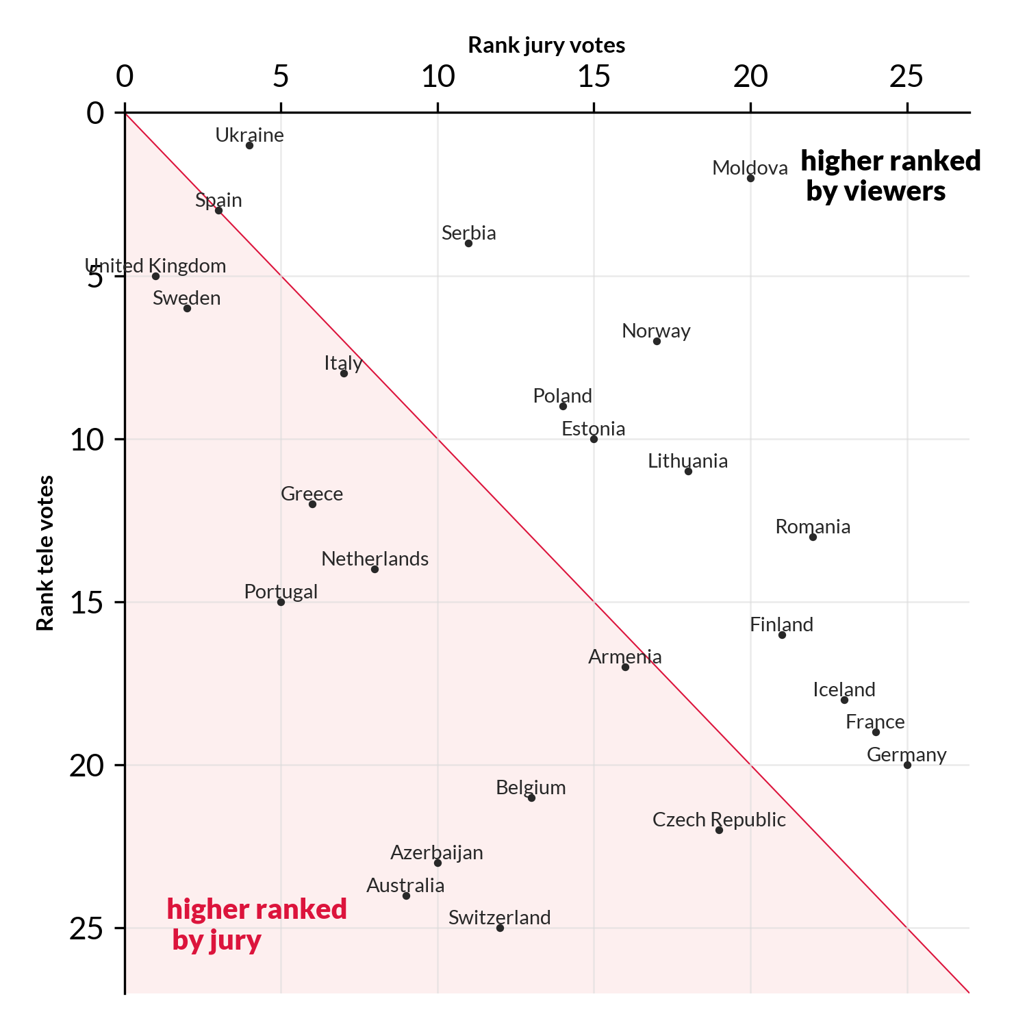
In 2022 the spearman correlation fell to R=0.38, meaning the jury and audience disagreed more on what constituted a ‘good’ song. In fact they only agreed on one country Spain 🇪🇸 (ranked 4th by both). The jury though the UK 🇬🇧 had the best song, while the audience voted for Ukraine🇺🇦.
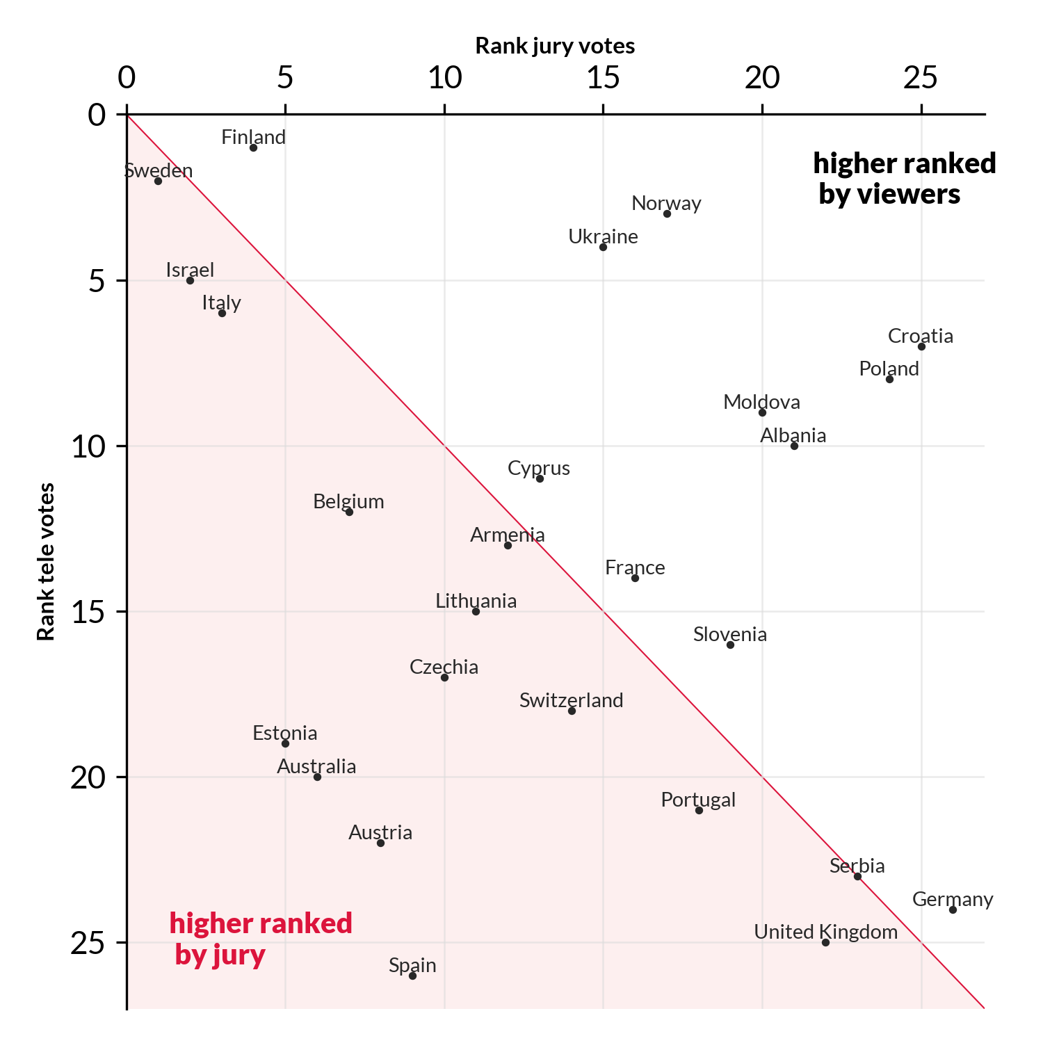 For 2023 the correlation decreased even further, to R=0.25. (Remember R=0 means no agreement at all, i.e. rankings are random compared to each other).
If jury and audience agree, countries will lie on the red line. However, we here see many countries lying on a line perpendicular to it.
This implies anti-correlation. E.g. countries are ranked high by the audience and low by the jury, or vice versa.
This includes Estonia🇪🇪 Australia🇦🇺 and Austria🇦🇹 (ranked high by jury, low by audience), and Croatia🇭🇷 Poland🇵🇱 Norway🇳🇴 and Ukraine🇺🇦 (ranked low by jury, high by audience).
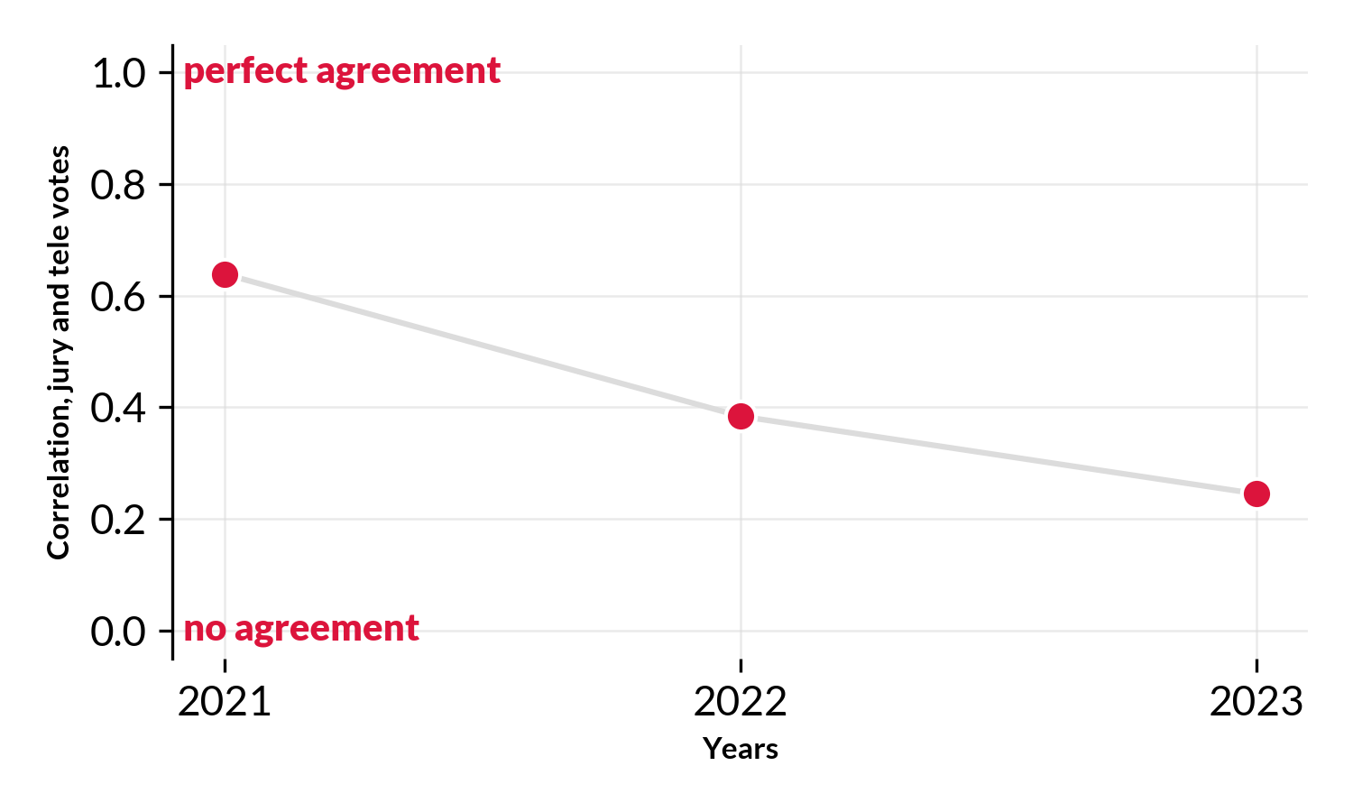
Looking across the last 3 years (all the data we have) we see years that the the correlation (alignment) between the two groups has dropped markedly, from a good alignment to almost no alignment whatsoever. Maybe its time to rethink the voting at Eurovision? Maybe its time to remove the jury and go back to a fully democratic process (i.e. points are 100% awarded by the audience). In 1998-2000 Eurovision actually (experimented with this)[https://twitter.com/TAledavood/status/1658200092472426496], I’m not sure about the outcome of the experiment and why they reverted back to jury votes/points.
It is unclear what has caused the difference between audience and jury to grow. One explanation could be that the populations have changed, i.e. what regular people think is a ‘good song’ and what musicians is a good song could have diverged. Another explanation could be that the size differences between the populations could cause these fluctuations. For example, the jury consists of only 5 people, so an single (grumpy?) juror can easily influence the overall vote of the jury, potentially introducing a lot of noise. On the other hand, the audience potentially consists of millions of individuals, where the sheer number of people can ‘average out’ the noise.
It could be interesting to model these effects, and look into how much noise thee is a jury votes, and possibly build a machine learning model to predict audience votes from different song characteristics. If I can convince one of my students, it could be a fun project.


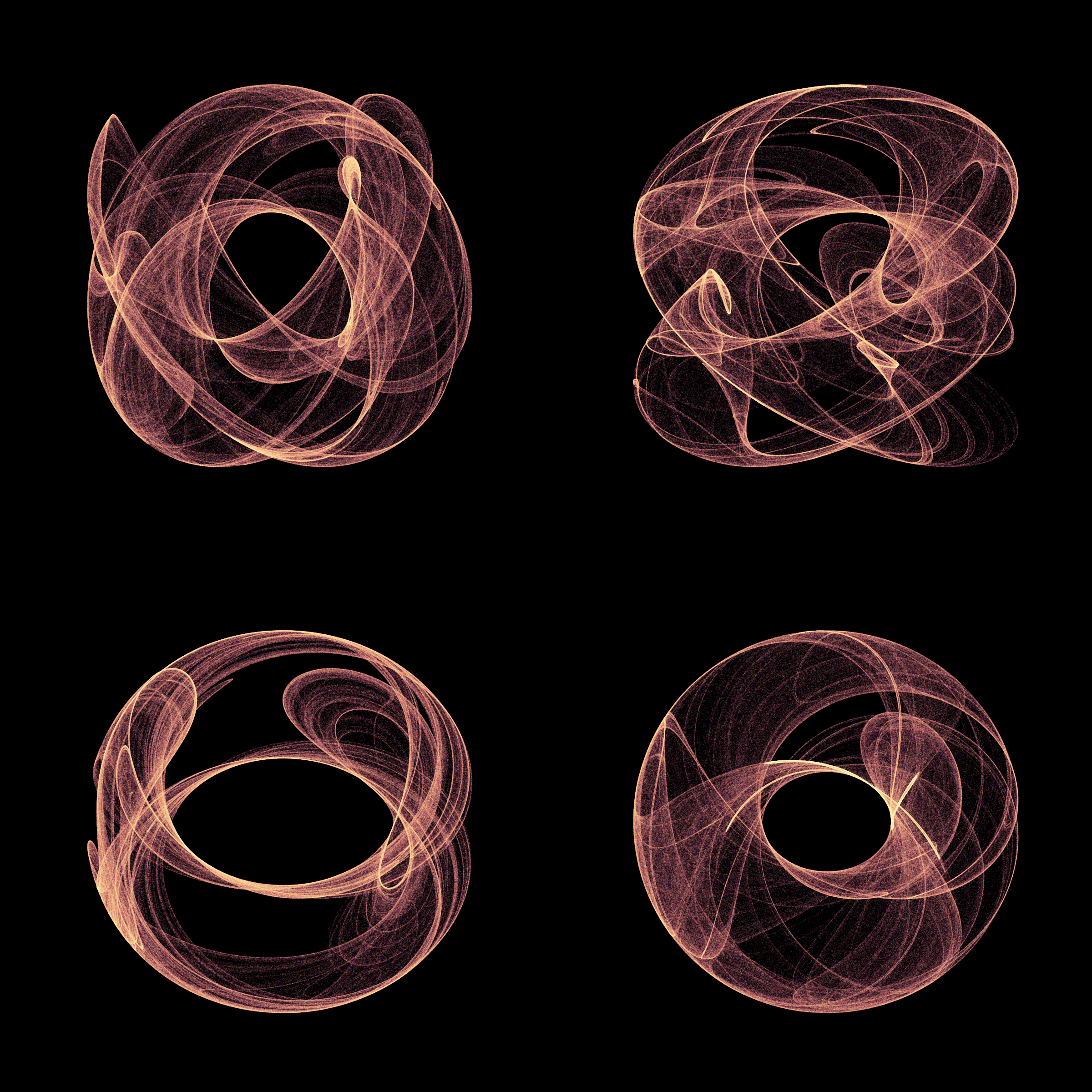 Strange attractors are capable of generating amazingly diverse shapes from abstract to concrete, and to butterflies - see more here.
However, all these images are single realizations of specific parameters and initial conditions.
And they are static, so I wondered: is it possible to add some movements, some dynamic to strange attractors?
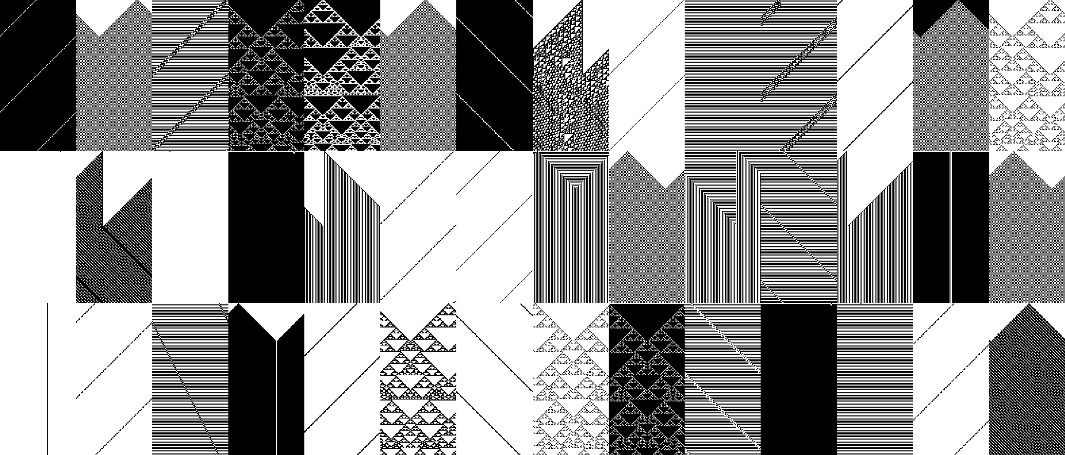 Cellular art-omata, or cellular automata as they usually are called, demonstrate how simple mathematical rules can lead to astonishing complexity.
 2018 has been a really exciting year, scientifically speaking a lot of new interesting studies have been published this year (so many that I have had a hard time keeping up with my to-read-list), and personally it has been a fruitful year where I was lucky to publish in PNAS and Nature Human Behaviour.
Here i have included my favorite scientific papers of 2018.
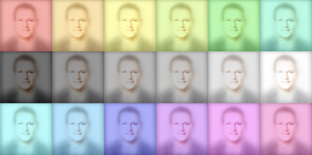 As Denmark is getting closer to the next elections the debate about refugees, migrants and their descendants has yet again resurfaced and is beginning to turn sour.
Disillusioned with this development and trying to get my mind off the issue, i wondered what the average politician looked like. I was thinking about something along the lines of this work or something like this piece by Soumitra Agarwal.
After a quick online search, where i was unable to find much work on faces of politicians, i decided to create my own.
The basic idea is to take lot of portrait pictures, overlay them, and take their median.
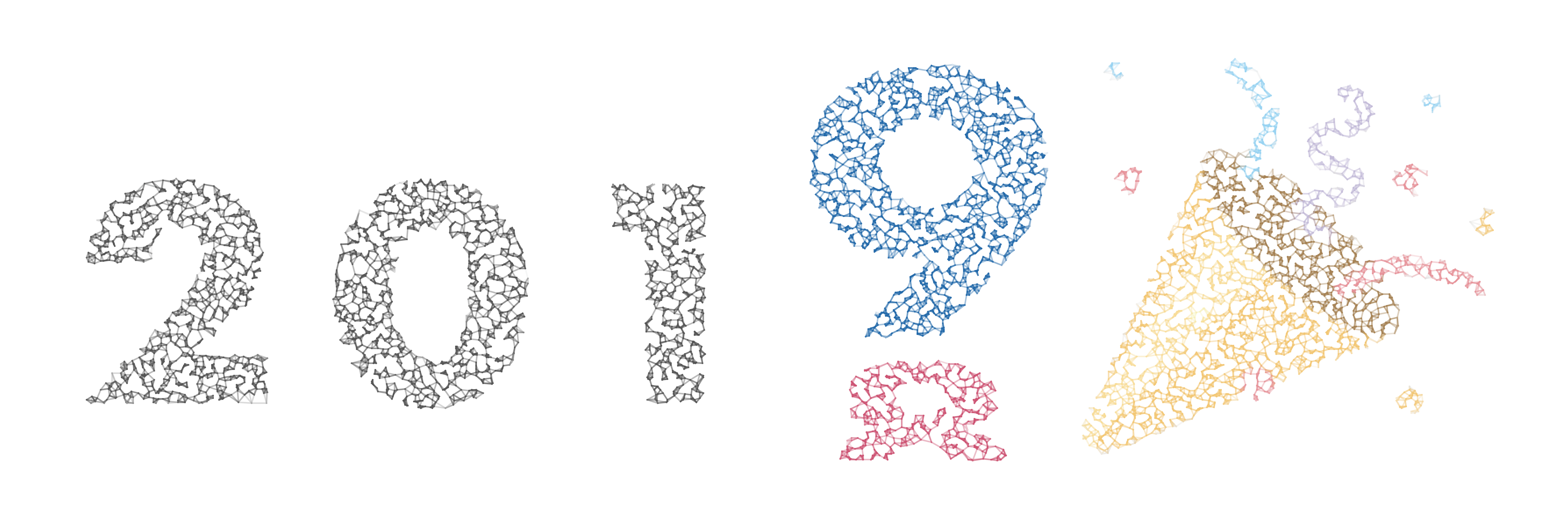
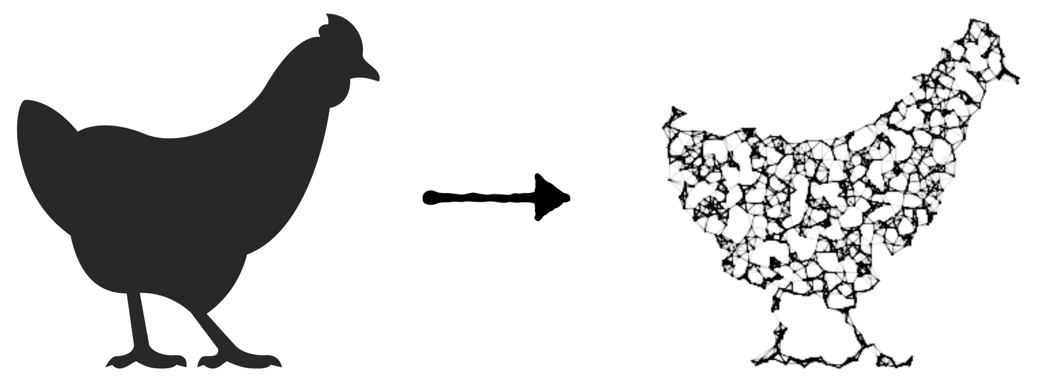 Trying to come up with a cool visualization for a small side-project, i was contemplating how to draw, or approximate, an object using networks.
During my creative process i remembered my colleague and friend Piotr Sapiezynski once told me how he once did something similar (see here and here).
Thinking his visualizations look absolutely stunning i tried to do my own version.
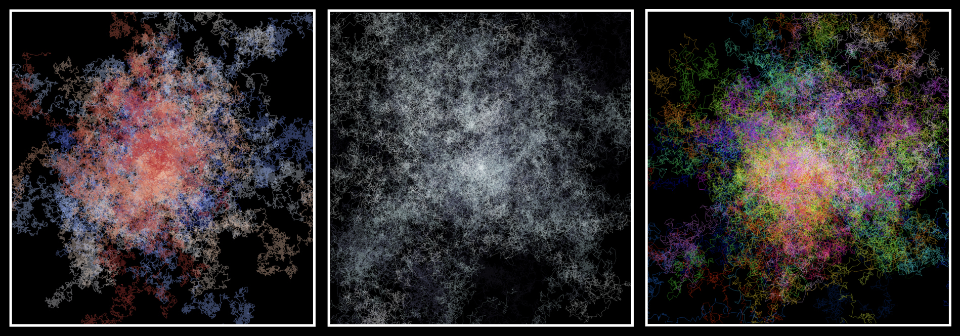 Trying to kill some time on a 4-hour long train ride I played around with simulating random walk in two dimensions.
Coloring each walker with it’s own unique colors, the motion of individual walkers will more or less look like confused ants moving around on a piece of paper.
Resembling the behavior illustrated below – see code below.
 I like to keep track of my life; collecting data about random things–one of them happens to be my travel patterns.
While visualizing my own travels I started to wonder what the global airport network might look like.
I remember reading about the structure of the airport network in the architecture of complex weighted networks by A. Barrat et al. but the paper never visualized the network.
To figure it out, I first needed some data, luckily OpenFlights.org has a database of routes as well as airports, which allows us to create some pretty nice looking visualizations (see above figure).
 This Sunday while surfing the web I came across a figure depicting the Rössler attractor and while looking at it, it suddenly struck me that I have always seen it depicted from this specific angle. But what does it look like from other angles?
Curious, I sat down, quickly wrote a python script to generate the dynamics, used Matplotlib to plot the figure from multiple angles, and ffmpeg to aggregate them into an animation (see below).
One thing lead to another and soon I found myself reading about other strange attractors, such as Clifford attractors, and writing code to generate the figures you see above.
 I received questions from a couple of people asking me how I drew the network featured on the cover of PNAS (read about it here).
Well, this blogpost is for you, and anybody else.
 We (Sune Lehmann, Arek Stopczynski and yours truly) recently published a paper in PNAS where we give our two cents on how to uncover meaningful, “fundamental”, social structures from temporal complex networks.
In addition to submitting the paper we also sent some pictures along which we felt would look good on the cover of PNAS.
As it turns out one of them was actually selected!
I was watching the season finale of Game of Thrones the other day and wondered—with so many characters in the series what does the interaction network look like? Well, as it turns out I was not the first person to get this thought. In fact A. Beveridge and J. Shan read through Storm Of Swords (third book in the series) and mapped all the interactions between characters, and released the data. You can read more about their cool project here. They are, further, planning to release data regarding the others books as well.
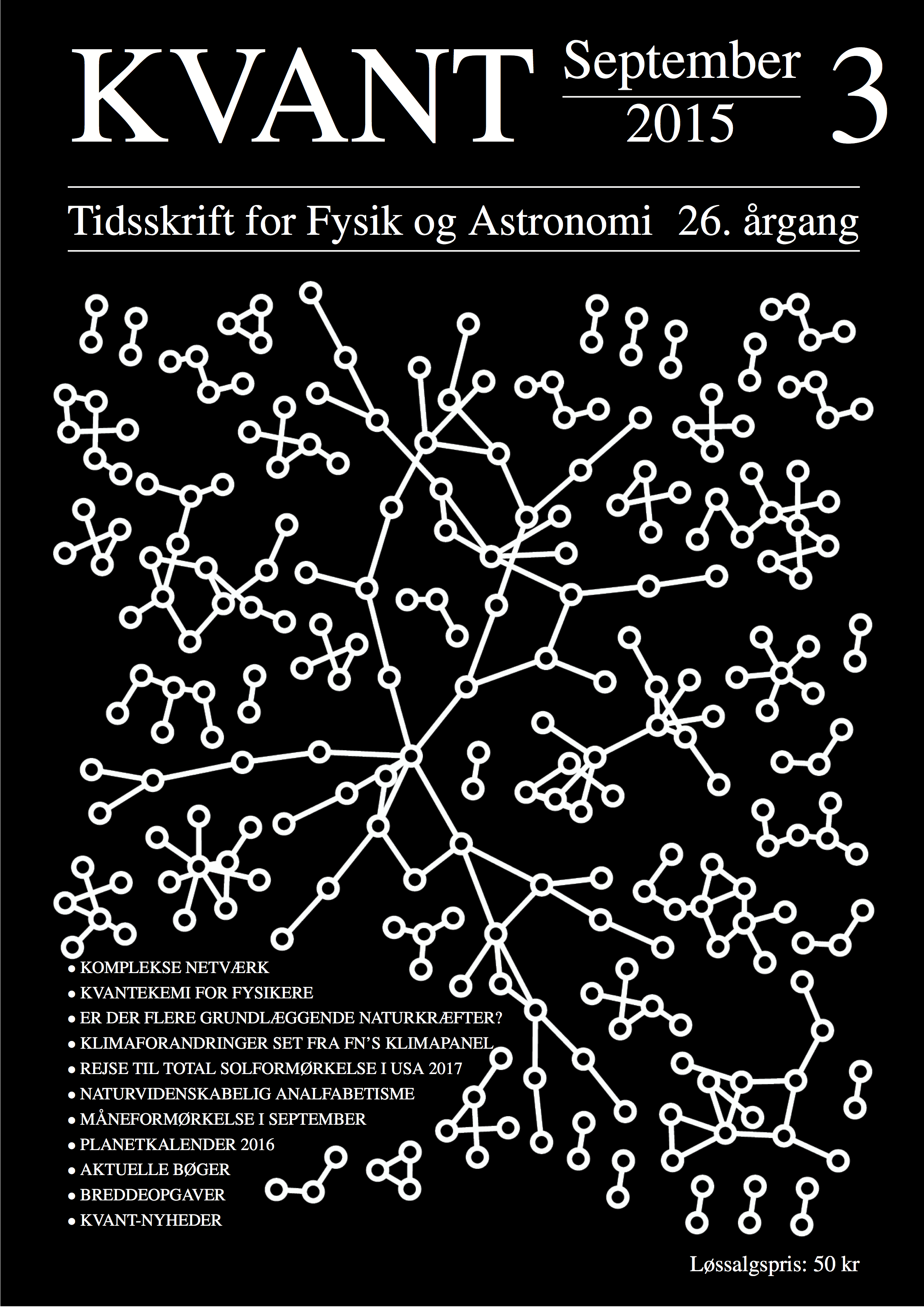 While finalizing my PhD I was asked, alongside Sune Lehmann, to author a popular article about networks by the magazine Kvant (danish journal for physics and astronomy). We wrote and submitted the piece and were fairly confident in our work. Nonetheless we were surprised when we were contacted by the editor who asked us for permission to use one of my figures for the cover! This is my first cover, and I gotta say, it feels awesome, next stop …. Nature :)
Have you ever wondered which areas of New York City are the most popular? You need not worry anymore, this little movie will answer your questions. The video shows the dynamics of pick-ups and drop-offs within a representative week. It is interesting to see how the popularity of areas changes over the course of a day, and how certain areas attract more attention during nighttime. To me the circadian patterns resembles a heartbeat.
One of the most iconic sights in New York are its Yellow cabs. They are ubiquitous and an important lifeline that tie the city and its inhabitants together. Understanding how cabs move around can give us new insights into how people travel within the city, how people use the city, and which neighborhoods are popular.
Is just around the corner! We have some cool results that hopefully should be published soon. Until then here are two teaser pics.
Since I as a kid watched my first world cup (1994), I have been hooked on football (or soccer as the Americans call it). Back then l I remember that almost every player used to wear Adidas Copa Mundials - a stylish, yet simple black leather boots with 3 white stripes.
 Ok, I know that I’m a bit late in posting this, but results form one of my papers [link] was featured in Forbes Magazine.
 Things are moving fast now.
We just uploaded another paper to ArXiv. Check it out!
Measuring large-scale social networks with high resolution
 Just submitted a paper - Wohoo!
Meanwhile until it is published you can find it on arXiv.
The paper investigates usability of the Bluetooth sensor is as a proxy for real life face-to-face interactions.
You can learn more about the data on the SensibleDTU homepage.
I will be giving a talk at the Niels Bohr Institute on December 4th. Topic will be “Social Contacts and Commnities”. It is based on the results and finding from the SensibleDTU project.
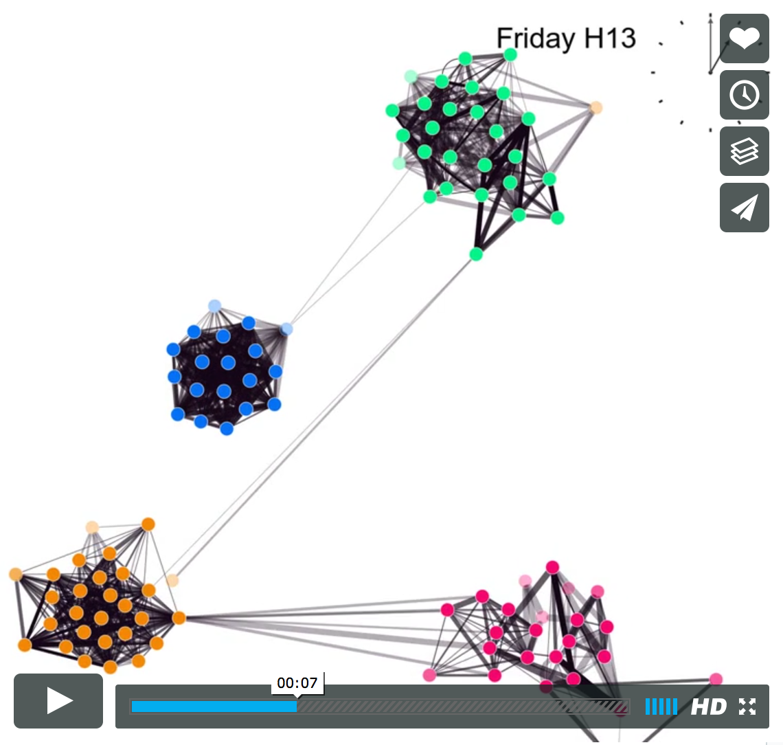 How do we as humans interact over the course of a day? The video shows proximity interactions for student participating in the SensibleDTU project for a randomly chosen 24-hour interval.
